portfolio
contact
coffee
avant shop

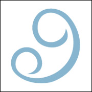
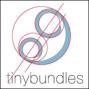
tinybundles logomark
visit www.tinybundles.com
Love.
Such an ethereal and broad concept is difficult to communicate without using a commonplace or overused icon like a heart. So our focus turned towards outward demonstrations of love - a hug, an embrace, a gaze.
MEANING
The tiny bundles mark represents the unity (oneness) of parent and child, the bond of love, a simple embrace, an intimate interaction, a glance. Other interpretations of the form could be a child within the womb, or a rattle.
FORM
The form is one continuous line, but creates two distinct circular forms. This simple elegant stroke is “loose” and freeform, which makes it playful. Yet the thickness of the line makes the form strong and stable, keeping the logo from feeling like it will blow away. Wit and playfulness balanced with strength and stability are two essential qualities in both a logo and the company it represents.
QUALITIES
This form is simple and easily identifiable. The repetition and interplay of circular forms make the mark both interesting to look at and memorable. The abstract qualities will let people create their own interpretations, and will keep them guessing.
Because of its simplicity, it will be easy to apply to almost anything, including the smallest of clothing tags.
All these contribute to the timelessness and flexibility of the Tiny Bundles logo.